[This blog was taken from a talk for the Pullman WordPress Meetup in September of 2019.]
Color plays a major role in branding. When choosing colors for your brand you need to keep in mind your industry, audience, and the feeling that you’re trying to convey. You will also want to pick colors that work well together and use them in a way that is accessible to all audiences.
Color psychology and your industry
The first thing I do when planning color for a new brand is look at what is currently happening in that space in regards to color. In a recent HelpScout article on the psychology of color, Gregory Ciotti states, “When it comes to picking the ‘right’ color, research has found that predicting consumer reaction to color appropriateness is far more important than the individual color itself. If Harley owners buy the product in order to feel rugged, colors that work best will play to that emotion.”
Industry examples
- Orange Juice: the majority of consumers prefer a middle “Valencia” orange as opposed to one that is too red or too yellow.
- Healthcare: 85% of logos in the healthcare space use some shade of blue; blue is trusted, while red is to be avoided because it is associated with blood.
TIPS:
- Pick colors that are appropriate for your industry but differentiate from your competitors in the same space
- Choosing colors that are not typical for your space may help your brand to stand out (just be careful)
- Complementary accent colors (opposites on the color wheel) can be more memorable than analogous colors (ones that are next to each other on the color wheel)
- If using the names of colors in your branding (like in makeup shades) people generally don’t like “brown”… but they like “coffee” (they will like “sky blue” more than “light blue”)
Color Psychology References:
- https://www.helpscout.net/blog/psychology-of-color/
- https://thelogocompany.net/blog/infographics/psychology-color-logo-design/
Consider Your Audience
Be aware that other cultures may have different connotations for the same color. Black may be associated with death in one culture while white signifies death in another culture. Do your research if you are marketing to another culture/group outside of your experience. Get feedback from a diverse group of people.
Men and women, in general, tend to like and dislike different colors. One US study found that over 20% of women reported purple as their favorite color while less than 1% of men favored purple. Over 20% of men in that study actually said that purple was their LEAST favorite color (they obviously didn’t have many UW fans in their pool…).
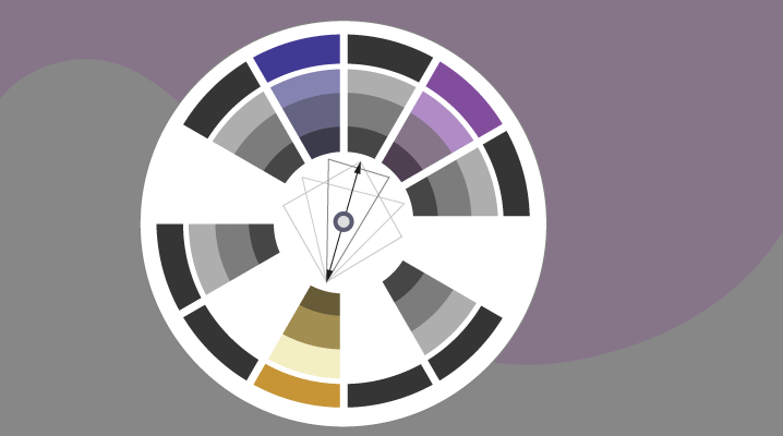
Choosing a color palette
Start with a main color. Then look for one or more secondary colors to go with your main color. There are all kinds of great color tools to make this easier.
Tools:
- Color wheel (the original paper color wheel, found in art supply stores)
- Adobe’s color palette picker
- Canva’s color wheel
Tips:
- Complementary accent colors are more memorable than analogous colors
- In the Adobe color picker you can choose from pre-set combinations like: Complementary, Split Complementary, Monochromatic, Analogeous, Triadic, Tetradic
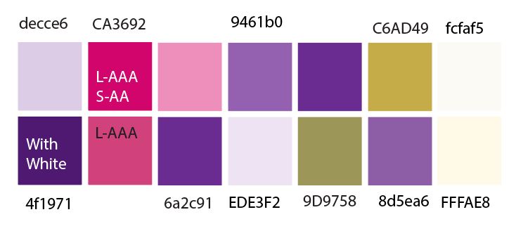
- Create a color palette chart/list with a variety of shades for different applications
- Make a cheat sheet in Evernote or in your project files with your color palette values in hexidecimal, RGBA, HSV, CMYK, Pantone, etc. for quick reference
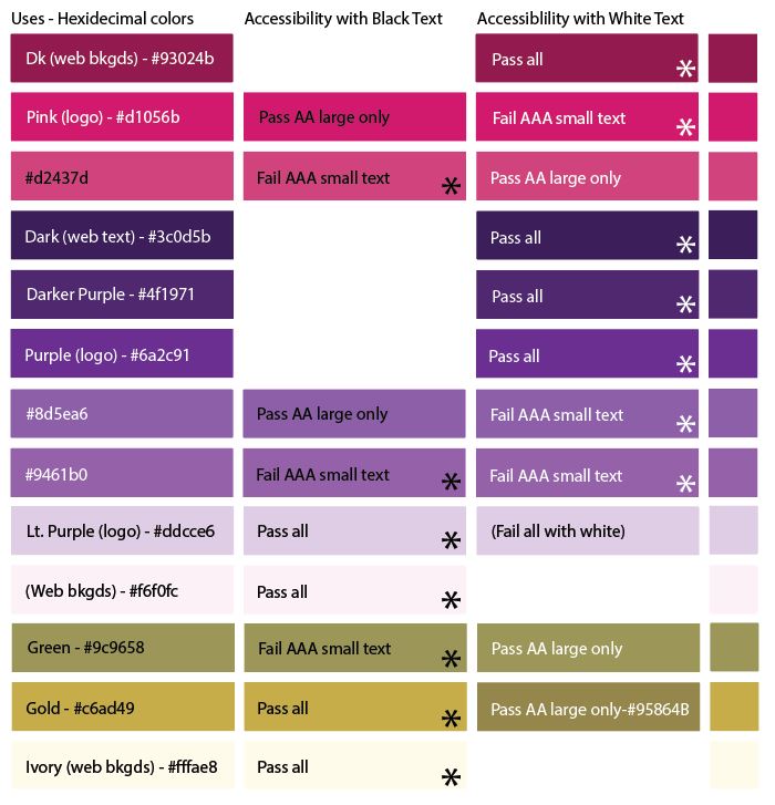
Color accessibility
BEFORE YOU GET TOO FAR… Test your colors, especially before using them as colors for text. Make sure there is enough contrast between your text colors and your background colors.
Example: it is surprising how DARK a green or blue has to be to be considered accessible.
Color accessibility resource:
- Check out this great primer on color accessibility from Stephanie Walter
W3C Recommendations for color contrast
Make sure that you understand the WCAG 2 (Web Content Accessibility Guidelines) and test your colors to make sure that they are at least at Level AA compliance.
Level AA compliance
- Minimum level of compliance
- 4.5:1 contrast ratio for normal text
- 3:1 contrast ratio for large text*
- 3:1 contrast for graphics and user interface components
Level AAA Compliance
- Maximum level of compliance
- 7:1 for normal text
- 4.5:1 for large text*
*Large text = 14pt/18.66px and bold OR 18 pt/24px or larger
Tools for testing color accessibility:
- Colour Contrast Analyser (free app to test specific color combinations)
- WebAIM contrast checker (online tool for checking two colors)
- Color.review’s color checker (find the closest accessible pair of colors)
- A11yRocks color palette tool (enter multiple hexidecimal colors and find out which combinations are accessible)
- http://contrast-finder.tanaguru.com/
Color blindness simulators:
- https://colororacle.org/usage.html (free download)
- https://www.funkify.org/ (paid Chrome extension—also simulates many other disabilities)
- https://www.toptal.com/designers/colorfilter (free)
Tips for accessibility:
- Don’t use color as the only cue to certain visual information—combine color with an icon change or text cues
- Be careful about putting text over images
Matching colors visually
One last thing: our brains can play tricks on us with colors. When using colors in a design, don’t go ONLY by the exact color value in your palette (like #56aad3).


If you want two objects (like buttons) to look like they are the same color and one is over a dark background and another is over a light background, you may have to adjust the colors visually. The same thing goes if the backgrounds are different hues. Our brains play tricks on us when colors are next to one another.

Conclusion
When choosing colors for your brand there are lots of things to keep in mind. First and foremost, research your industry and make sure that your primary color choice is appropriate for your audience. Choose secondary colors that complement your primary color. Make sure that text colors have enough contrast with background colors so that they are accessible. And last, don’t forget to make visual adjustments to colors if needed so that our brains say they match. 🙂
Leave a Reply