It is possible to pay $300 for a kick-ass custom logo design, but not very likely. You are either extremely lucky or you have a friend/relative/student who is undercharging you. A great logo is crafted with meaning and that takes time…
Graphic designers spend time learning and honing their skills. If you invest money in a nice car, you want it fixed by a professional, and you expect to pay professional rates. Hiring your brother’s friend who fixes cars on the side instead could lead to an appearance on Judge Judy… The same holds true for investing in the design of your brand. If you want something professionally designed, expect that it will cost more than $300.
Logo design is all about meaning
I have this incessant need to make meaning out of things. It’s gotten me into trouble in some areas of my life, but it is a helpful quality in a graphic designer. When I design, I really try hard to only add visual elements that support the message—those that help in accomplishing the goal at hand.
Logo design is all about meaning. It takes an investment of time and thought to first understand the goals of the person or entity for whom you’re working. You’ve also got to get to know the person/organization and figure out what they like and what they don’t like, what they are trying to say, who they are, and how they want to come across.
When I’m getting to know a new client, it helps me to visit the space where they work. This was something that I failed to do early on in the process of designing a logo and website. I had been struggling to hit on a look that resonated with this person until I finally visited her office. By being in the space she had created for herself, I found inspiration that ultimately helped us* to come up with a logo as well as other illustrations for her website. (*Note that I say “us.” I feel that the design process works best when it is a collaboration between the client and the designer.)
Great custom logo design involves research
Brand development involves research—taking into account who your client is trying to serve as well as who else is competing in their industry/space. Empathy is required in order to get into the heads of the users as well as to understand the personality of the organization serving them. Coming up with visual ideas that embody who they are and that will resonate with their particular audience takes thought and time.
Creative play requires time
Time… That is really the most important commodity when it comes to custom logo design. When I feel like I have enough time, then I am free to play.
Creativity most often comes when I have ample time to play (over a number of weeks or months if possible). If I have only 3 hours to come up with something, then I’m going to be stressed out and not in any mood to play. I will instead be watching the clock and worrying about that looming deadline.
You’ve probably heard the expression, “my best ideas come in the shower.” The reason for this phenomena is that when we are focused on a problem and then give our brain some down time to do some other activity that is somewhat monotonous, our subconscious will kick in and work on the problem in the background.
I watched my dad, an electrical engineer, model this when I was a kid. I remember going on a longer vacation and about a week into the trip my dad woke up in the middle of the night and wrote out the answer to a design problem for work. He was thrilled and called in the answer to his colleagues. (We were thrilled because he could finally, totally relax!) Obviously, the best thing his employer did was send him on vacation. Without that time and psychological space to play, he might not have come up with the answer for another month or two.
Time gives you permission to fail
The most important thing about having time is that you have time to fail. Creatives (you included) need to be able to try things and fail. The process of making attempts is where new ideas emerge.
I remember hearing about a famous photographer who used his photographs (slides) that didn’t work out (it was something like 199 out of 200) as the raw materials for building coffee tables. Even the most accomplished artists produce a lot of crappy art. Being unafraid of that, or being afraid and then creating anyway is one of the keys to being successful.
The journey to a modern logo design
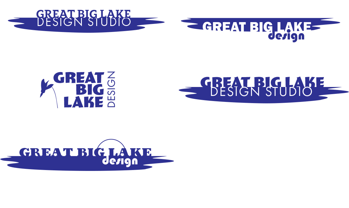
As a case in point, check out my first attempts at creating a logo for Great Big Lake Design. I had an idea. I wanted to communicate what it was like to be at the lake. That eventually lead to the idea of sensing the depth of the lake. I wanted to express that feeling with simplicity and quiet. I have an affinity for modernism, so I wanted that to come across…
So here are some early attempts…

Yeah. Not there, is it? Not even. I’ve got the letters sinking into the lake in different ways—that’s good, but what’s up with the choice of typefaces on the 6th one? 70s disco meets Bauhaus? (I was into that last one for a bit.) ? But this is play. It’s okay to try it. It might have worked, but you don’t know until you play a bit.
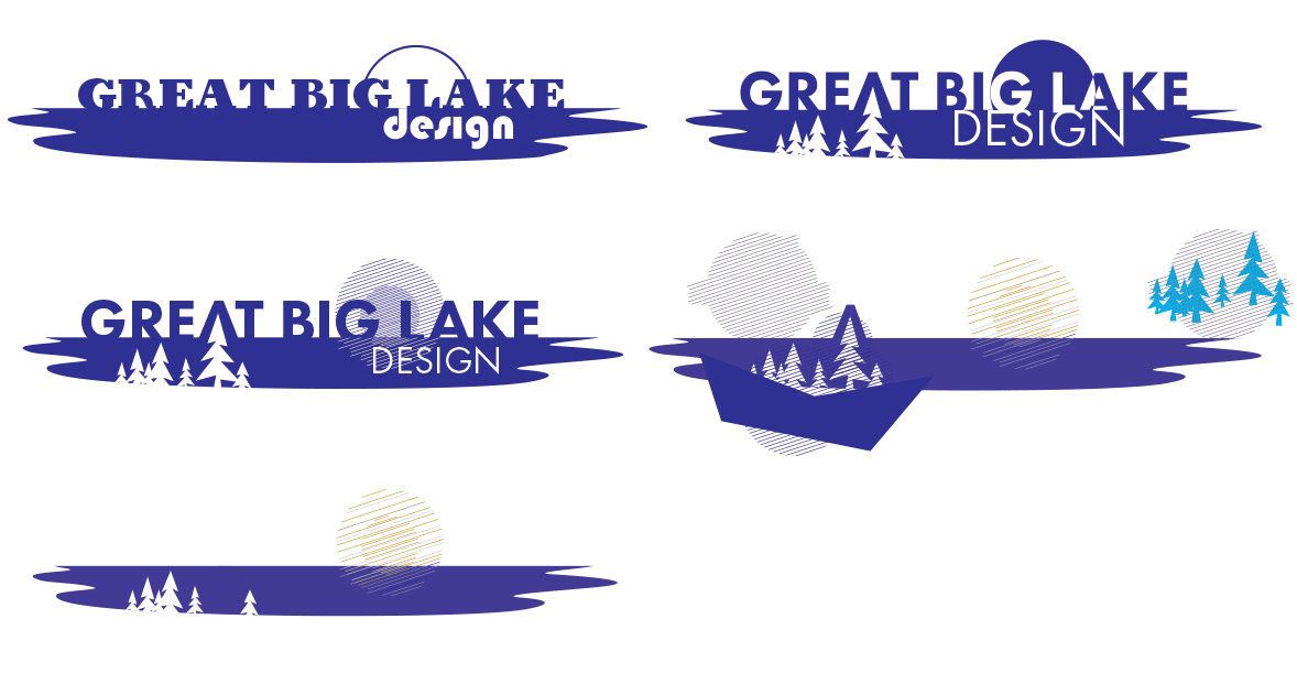
Have I mentioned that the majority of graphic designers are introverts and tend to hate people looking over their shoulders while they design? Well… (deep breath). Here are some more iterations…
Tree variations

Yes, I love trees. I love to sit under trees, to look up into trees, to paint trees, to hug trees. When I was a kid one of my favorite books was “Andrew Henry’s Meadow.” In it, Andrew Henry and a bunch of his friends run away from home and end up in a meadow where Andrew Henry builds houses for each of them. I always wanted to be the girl who had the tree house, hanging out with the birds—incidentally, my husband grew up loving that book too, though he wanted to live in the underground house with the rabbits. (We’re still trying to work that one out.) Anyway, I thought maybe adding trees in could be fun, but it got way too literal.
Sun variations

An element that came out of playing with these ideas was the sun. I started having more fun with the sun as I went along. I do love the idea of the eastern sun… And as the sun got more detailed, I could see that I needed to just hint at the edge of the lake. One line was enough. Often this is what has to happen—you have to push your design too far into the literal and then dial it back. And that takes time.
Icon variations

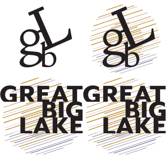
Once the sun became a focal point, I started playing with it on it’s own as an icon. I used another classic typeface, Doves Type, and playing with the acronym of our business name, made an Adirondack chair out of the letters. (We really wanted to communicate peace of mind, kicking back, etc.) I didn’t have the chair in mind when I started, but as I moved the letters around, I just kind of stumbled on to the chair.
So, if you want a well-crafted logo, realize that it is an investment of time. Time on the part of the designer and time on your part as well.
What if I can’t afford to hire a graphic designer?
The truth may be that you just can’t afford to hire a professional graphic designer right now. In that case, there are some cheaper options that you could try until you have the money to invest. Realize, though, that having poor branding makes you look unprofessional and could potentially hurt your business in the long run. Look at your closest competitors and make sure that your branding is at least as polished as theirs.
Create your own logo
You could create your own logo. You don’t have to have a degree in graphic design and the latest MacBook Pro to design a great logo. Some of the most famous and prolific designers didn’t have a degree. Having the degree just proves that the designer has spent time practicing and has had some mentoring. Again, this goes back to the idea that good design involves an investment of time.
Choosing a typeface for your brand/logo
Sticking to a design that relies on a classic typeface—either a very plain one or one that tastefully communicates a mood could be a good temporary option. Choosing a typeface can be a long process and a lot of fun. These days there are so many typefaces from which to choose. It’s best to use a face that is well-designed. There are some decent free fonts, but you may end up having to pay for a typeface if you want something unique and well designed.
A good typographer pays attention to the proportions of the different parts of the letters. They also take a lot of care in designing the spacing between letters. For a comprehensive look at typography, check out Thinking With Type by Ellen Lupton. If you want to go down the rabbit hole of typeface creation, check out this article from Jeremy Mickel at iLoveTypography as a primer for what is involved in designing your first typeface.
NOTE: “Typeface” is the correct term to use when you are talking about choosing a typeface/font. The term “font” was originally defined as “a receptacle in a church for the water used in baptism” or “a reservoir for oil in an oil lamp.” So you can think of a font as the container that holds a typeface. A font is actually a collection of characters (lower and uppercase letters, numbers, punctuation, and/or other symbols), usually of similar style, that are packaged together in order to save them and install them on your computer. Anyone can create a font these days, but not everyone will take the time to craft a cohesive typeface of beauty.
When you’re choosing a typeface you may want to “try some on.” I usually go to one of the big typography sites like Myfonts.com and do some browsing. When I find a typeface that looks interesting, I go to its home page and type the words to be used for my logo into the form field there. That way I can quickly see if I like the feel of the letters.
Trying on typefaces

When I was working on the Great Big Lake logo, I tried on a lot of typefaces. Some fit rather well and some came off pretty campy. But when you’re in play mode, that’s okay. I would have liked the last one in this sequence if I was designing the title for a movie about a summer camp, but it didn’t work for a design firm.
Each typeface comes with its own history. You may want to read about that history a bit and then see how that typeface has been used in the past.
Avoid a trendy typeface
Be careful not to pick something too trendy or decorative unless you have a very good reason. Down the road your logo could look dated.
Helvetica, designed in 1957, is the most common typeface used in corporate logo design. It came out of the Swiss Modernist movement (“Helvitia” is the Latin word for Switzerland) and was intended to be neutral yet human. This revolutionary typeface was used by countless corporations and organizations to modernize their looks in the 1960s. Helvetica was called “the perfume of the city” by designer, Rick Poyner, in the 2007 movie, Helvetica because you see it everywhere. It has continued to be popular, though some designers would argue that it has been overused and is now too common.
If you’re not sure you know what you’re doing, pick a classic like Helvetica, Futura, Franklin Gothic, Caslon, etc. and set your company’s name in that face. Try it with upper and lowercase letters and try different weights of type. Once you’ve landed on your favorite, if possible, do a little kerning (make sure all of the spaces between the letters look similar/balanced).
Adding an icon to my logo
To give your logo a bit more personality, add some sort of image that fits in a square shape to the left of your text. You can then use this little graphic as the icon for your brand. An icon is an important part of your branding. It can be used up in the location bar of the browser next to your website address as a “favicon.” Your icon can also be used as the graphic for the button that people see on their phones/tablets and browsers once they’ve visited your website.
If you have a WordPress website you will need to add some sort of icon during the process of setting up your website. Make sure that your icon is at least 512 x 512 pixels and is square. Go to “Appearance > Customize > Site Identity > Site Icon” to upload your icon. (Note: when using your logo/icon, you will need to export it to either an SVG file (talk to your web developer about this option) or a JPG or a PNG file.
What tools should I use to create my logo?
Online drawing tools
If you have an artistic eye and an idea, you might try a logo creation tool like Canva. Many of these tools have a free version that allow you to create a small version of a logo and then a paid plan that gives more advanced options.
Vector drawing software
If you’re brave, you could also use an actual drawing program that supports vectors, like Adobe Illustrator or Affinity Designer. A vector drawing program is different from a photo program in that the letters and other drawings are made with outlines (linear algebra) as opposed to rows and rows of tiny squares (pixels) like a photo editing program. This option will give you the most flexibility because you will be able to enlarge the logo without losing quality. A photo editing program will only allow you to make things smaller than their original size.
Adobe Illustrator and Sketch (Mac only) are the choice of many designers. A more affordable vector graphics program is Affinity Designer (currently a $49.99 one-time fee). There are also a number of free vector graphics software options like LibreOffice Draw that would be worth a look. YouTube is your friend—search there for tutorials on whatever you choose.
If you’re not visually inclined, but you have an idea of what you want, you could go to a place like Fiverr.com and hire someone there to create your logo for less than I would charge. The person you hire may not spend as much time as I would or ask you about your business goals, but this is a more affordable option.
Getting ready to design a new logo
To prepare for a successful branding collaboration, begin by thinking about who you are and what you’re trying to communicate. I ask my clients to come up with adjectives that describe themselves or their organization (traditional, progressive, modern, funky, simple, industrial, etc.). If you hire someone and they aren’t asking you a lot of questions, that is a reason to be concerned that maybe they don’t know what they’re doing.
Gather screenshots and photos of logos and other items that you like. Keep them in a folder on your computer for your designer. You can do the same sort of thing by creating a board on Pinterest. Stock photography websites can be a good resource for images. Download drafts of images as samples of what you like.

Think about typefaces/fonts that you like as well as colors that you may want incorporated. Be aware that the most versatile logos work in black and white—color is added as an enhancement. If your logo will be primarily seen online, though, you won’t have to worry as much about that. Also think about how the logo will be used in your promotional materials or products. You may need a horizontal version and a vertical version of the logo for different uses.
Having your designer visit your business or personal space isn’t always possible if you are working with someone who lives far way, but there are other things that you can do compensate for this. As a client, send your designer photos (or make a quick video tour) of the space where you work if it’s a place that you’re proud of. If it’s not, take photos of other spaces you like to convey the style that you’re trying to achieve.
Ready to invest in your business?
Investing in a custom logo is one of the most important things that you can do for your business. It, along with a coordinated brand, conveys professionalism. People are more apt to trust a business that has a polished image. It communicates that you care and that you strive to do quality work.
I remember going to an amazing concert featuring an Irish guitar trio. The guitarists stopped the concert at a number of points to tune their instruments on stage and finally one of them said, “We tune because we care,” and smiled. I take time with logos because I care.
If you think you’re ready to invest in a new logo design for your business and would like to work with us, contact us by filling out our Design Project Worksheet.
Leave a Reply